
This assignment is a follow up from Class Exercise 4, and the same data set from QS World University Rankings will be used.
.jpg) |
| Snapshot of 2012 QS World University Rankings (Top 12 Overall) |
The first step for this assignment is to generate initial questions to guide my analysis. Here are some sample questions from class exercise 4:
- Which university has a higher proportion of international students?
- Which university has a higher academic reputation?
- Universities in Japan has a notably low proportion of international students, regardless of overall ranking. Why is that so?
- Why is it that the top universities are located in America and United Kingdom?
- Is there relation between the age of the university and its ranking?
- Is research strength crucial in the overall ranking of the universities?
For this assignment, I would like to focus on finding out how (if any) the proportion of international students and faculty members affect the overall score i.e. ranking of the university. I would also like to find out which countries or regions are more open in terms of accepting international students and faculty members. My reason for these is that globalisation affect many aspects of our lives, and it would be interesting to be able to look at it in terms of openness of universities to international students and faculty members.
The next step is data transformation, whereby I need to assess the suitability of the raw data in answering my questions. The categories that will be useful to answer the questions are institution, country, international faculty score, international score and overall score. Although there is no column for region, it can be easily derived based on the countries the institution is located at. Some cleaning needs to be done with the existing data. All the columns which are not useful for my analysis are deleted, and all those institutions which does not have the complete data for the above-mentioned categories are also deleted. The column for rankings are not useful since I will not be able to get an average score for ordinal data. For that, the scores are used instead. After omitting several data, I am left with 395 universities to work with, an acceptable number to carry out the analysis. I then change the name of the countries from the coded version to the full name, e.g. SG to Singapore since not everyone is familiar with such coding. Following that, I come out with with a new column i.e. 'region' and derived it based on the categorisation by Central Intelligence Agency in The World Factbook 2010. There is a slight problem with France, since it can either be Europe, South America or Central America and the Caribbean. I checked the location of all 19 universities in France as listed in the raw data using Google maps. All of those fall within the area of metropolitan France thus thus I had categorised them as Europe for the region. Finally, the reformatting is done.
+%5BSnapshot%5D.jpg) |
| Snapshot of 2012 QS World University Rankings (Reformatted Data) |
The next step is view creation. I have chosen Many Eyes by IBM as my choice of online visualisation tool. Many Eyes is quite easy to use for a first time user like myself. It does come with its own limitation as well.
I use a scatterplot to show the relationship between variables to answer my first question on how (if any) the proportion of international students and faculty members affect the overall score i.e. ranking of the university. From the scatterplot, it can be noted that while the universities with a high international faculty score and high international student score usually have a high overall score, there are those universities with low score on both areas yet still able to achieve an overall high score. Some examples include The University of Tokyo and Kyoto University. There are also those universities with high score on both areas yet have a low overall high score. Some examples include University of Essex and Brunel University. The problem with this visualisation is that I cannot categorise the data based on average country score or average regional score. However, the visualisation is good enough to answer my first question.
I initially wanted to use the world map to answer my second question that is to find out which countries or regions are more open in terms of accepting international students and faculty members. However, there are several problems that I run into. Firstly, Many Eyes does not recognise the country Hong Kong and Singapore. This means that data from both of these countries will be missing. Secondly, Many Eyes does not display the average score for the respective countries. Instead, it only display based on the highest score available for the respective countries. The data might thus be misrepresented due to the nature of the outliers. To avoid this problem, I used the stack graph instead. Stack graph is able to show clearly which country or region has a higher proportion of international students and faculty members. However, it looks very messy when too much factors are being compared such as the case of institution. This does not pose a problem since I do not have the intention to compare based on institution. From the stack graph, I am able to find out that Singapore has the highest average score when it comes to international students and faculty members combined. When compared among the regions, Oceania has the highest average score.
Despite being able to formulate the questions that I have, the previous 2 interactive visualisations has failed to give the audience a good feel of where those universities are. My next step is thus to work on an interactive world map. Knowing the limitation of the software, I had to rework on the data that I had reformatted earlier on. I use Microsoft Excel to calculate the average scores for all 3 categories i.e. international student score, international faculty score and overall score, for the respective countries. I then insert another column namely combined international score which is the summation of international student score and international faculty score. Thus I have a new data namely 2012 QS World University Rankings Based on Countries' Average.
+%5BSnapshot%5D.jpg) |
| Snapshot of 2012 QS World University Rankings Based on Countries' Average |
Since Many Eyes does not recognise the country Hong Kong and Singapore, I have decided to switch to another platform called StatPlanet. This platform was suggested by one of my lecture mates and it does display the data nicely. StatPlanet is also able to formulate both of my questions in a single platform. Unfortunately, I am not able to share it here due to some technical limitation. However, the following screencast will demonstrate how I use StatPlanet to formulate both questions.
From the interactive visualisation created, it is clear that the top 3 countries with the highest combined international score are Singapore (198.1), United Arab Emirates (187) and Hong Kong (183.3). Regionally, Oceania region seems to be the darkest shaded region. UAE is a good example of a nation with a high combined international score yet has a relatively low overall score (33). However, this interactive visualisation points out that there is a high correlation (0.53) between overall score and combined international score. This means that cases such as UAE can be considered as outliers. It should be noted that such correlation is expected since international indicators are already factored into the overall score based on the 2012 QS World University Rankings. What is important is that the data shows that there is a possibility to get a high overall score even with a low combined international score. A good example will be Japan with an overall score of 58.2 (7th in the world), yet the combined international score is just 36.4 (32nd in the world). An interesting finding that I got from this interactive visualisation is that the correlation for East Asia and Pacific region (0.65) is higher than that of the world (0.53).
With all these findings, I can then move on to the second part of the assignment which is to present these findings in the form of infographic. It is not possible to squeeze all the findings in a single A4 sheet thus I will have to choose wisely what I want to present. As such, I have selected the following to be included in the infographic:
- Positive correlation between the Combined International Score (Average) and Overall Score (Average)
- Top 3 countries based on International Faculty Score (Average)
- Top 3 countries based on International Student Score (Average)
- Top 3 countries based on Overall Score (Average)
The theme for my infographic will be on globalisation whereby the data will report the effects of globalisation on the countries' universities. I have decided to make the overall look to be like the front page of a newspaper to show the importance of the findings. Using all this ideas and information, my infographic is thus created.

There are several critiques that I received for this draft. There is no clear indication on what the different colours of the dots represent. Some of the information provided seems to be too technical such as the correlation digits. All these make the infographic not easy to be read.
I then take another look at the interactive visualisation to look at how I can report the data in a clearer manner. Since the most number of international students and faculty members is recorded in a Southeast Asia country and a Middle East country, I have decided to concentrate on the trend for these two regions. I have omitted Taiwan and Hong Kong from my analysis since they are not part of ASEAN. I realised that there is a positive correlation for the case of Southeast Asia but a negative correlation for the case of Middle East. This information forms the core for the next iteration of my infographic. Keeping in mind that my audience might not understand the technical terms that I have used earlier on, the next infographic aims to present the information in the simplest manner possible.

I was given the feedback that this iteration is easy and clear to read. However, there is a slight confusion for the dots since it looks like the dot represents a certain university. To make it even clearer that the dots represent the country's average score, I had changed the dots to the flag of the country instead.

I was then given the suggestion to include the institutions as well to give a clearer picture of the trend. Since StatPlanet is not able to process my data by institutions, I had decided to take up the suggestion to use Tableau Public. I reformatted the data '2012 QS World University Rankings (Reformatted Data)' to include only Southeast Asian and Middle Eastern countries. This will make the data more manageable.
.jpg) |
| Snapshot of 2012 QS World University Ranking (Southeast Asia & Middle East Data) |
I then input this data into Tableau Public and finally came out with the following graph. The graph is formatted in such a way that it matches my infographic.
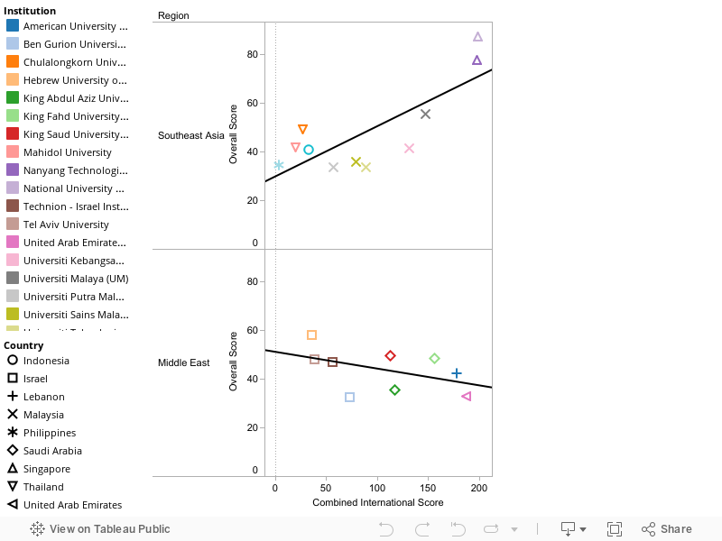
Lastly, I recreate the infographic based on the new scatterplots. The trendline for the scatterplots came out as expected. However, this new infographic shows another interesting trend, that is the universities in the respective countries tend to adopt a similar stance on the intake of international students and faculty members.

No comments:
Post a Comment